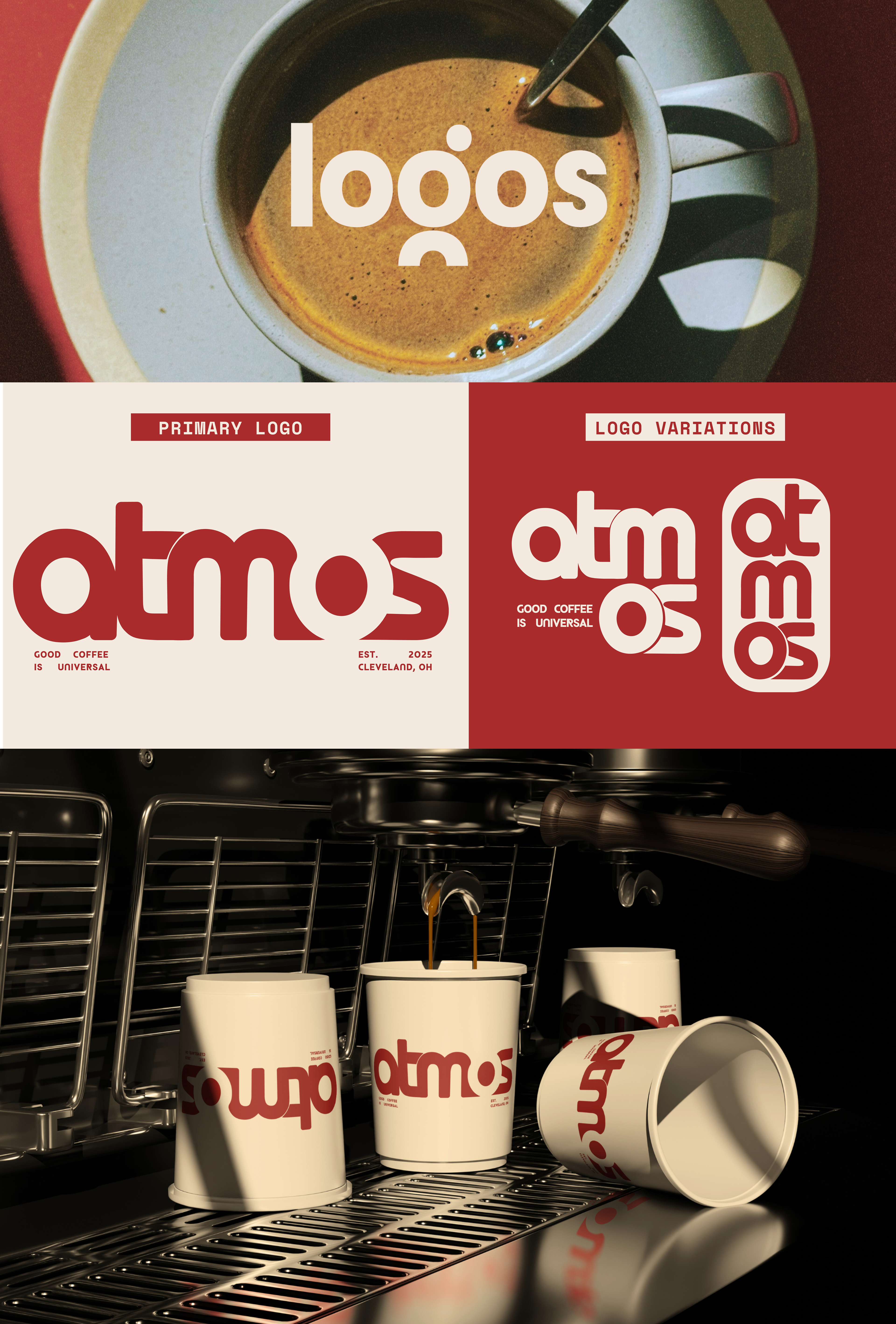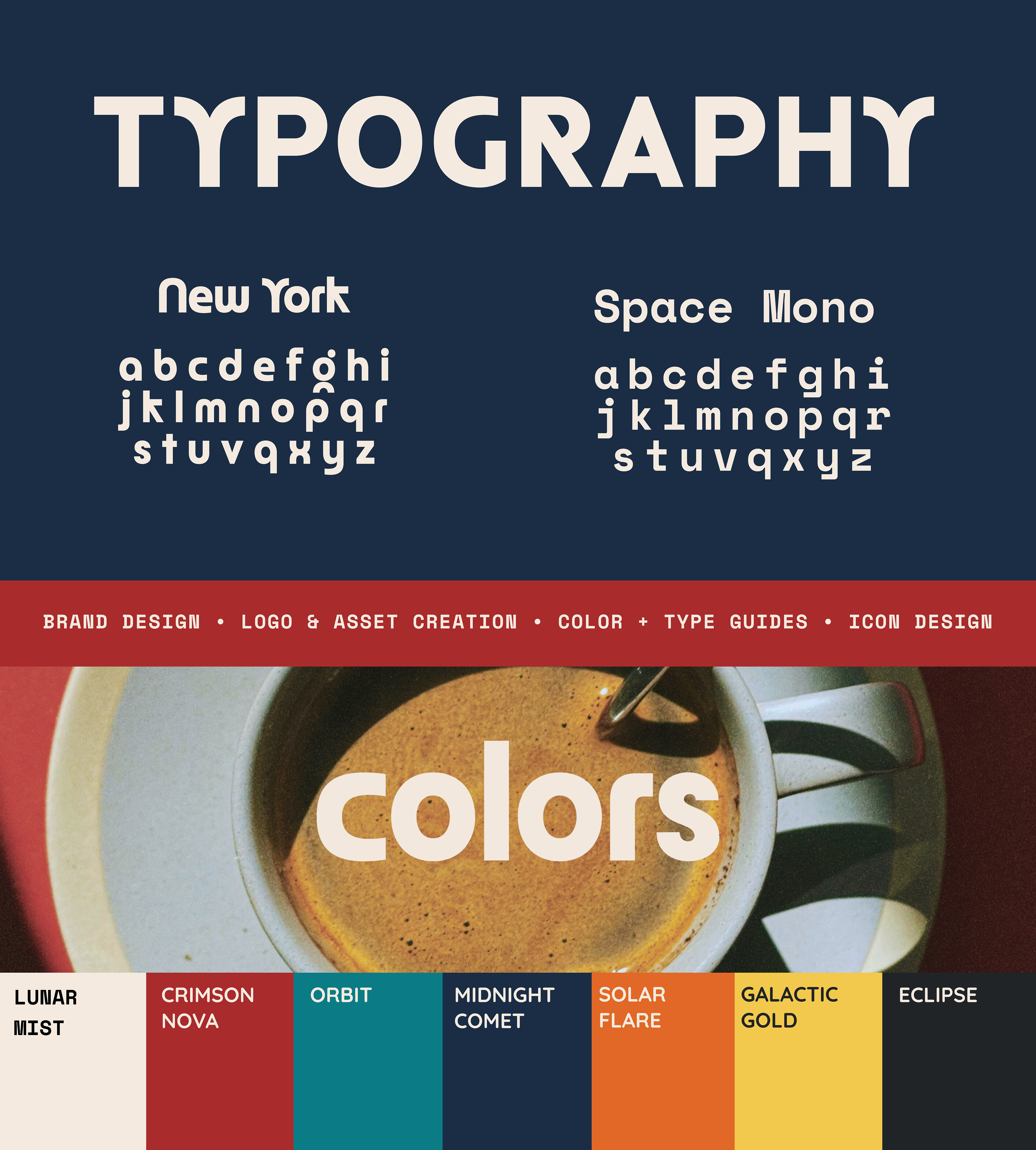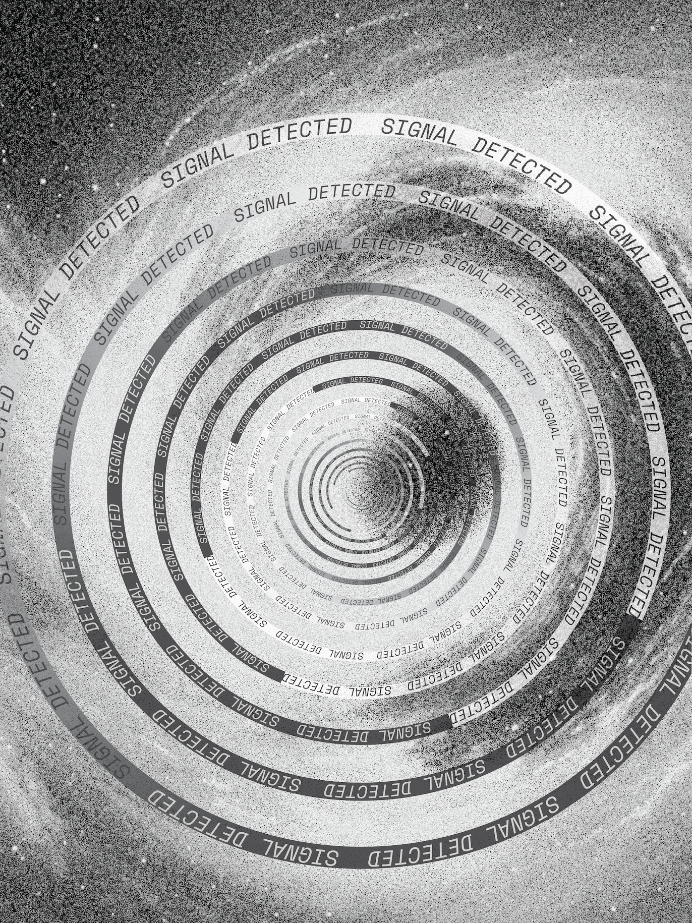
Creative Direction: Bauhaus geometry meets a cosmic vibe
What I did: Branding, logo and asset creation, color and typography guides, icon design, and social media content.
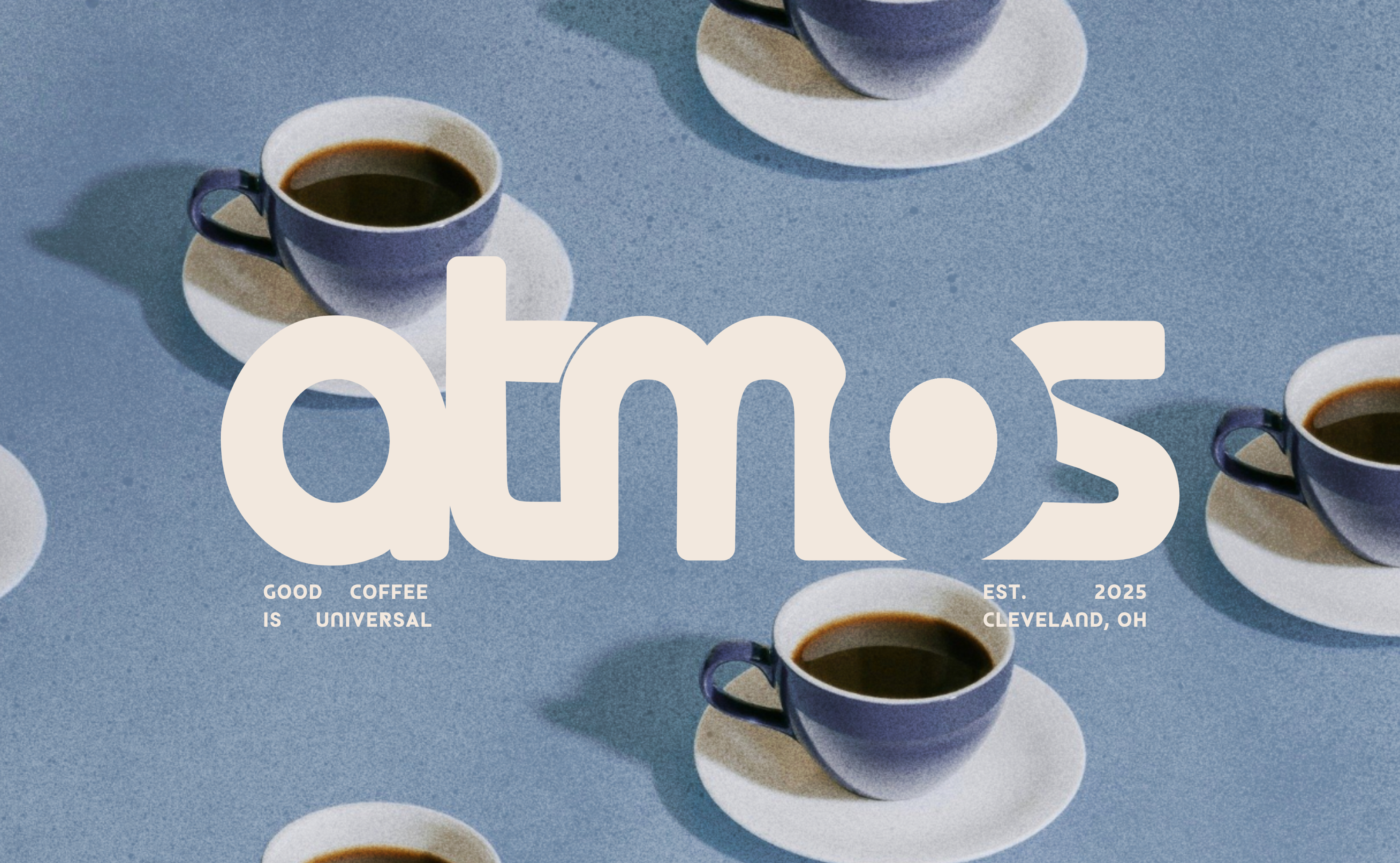
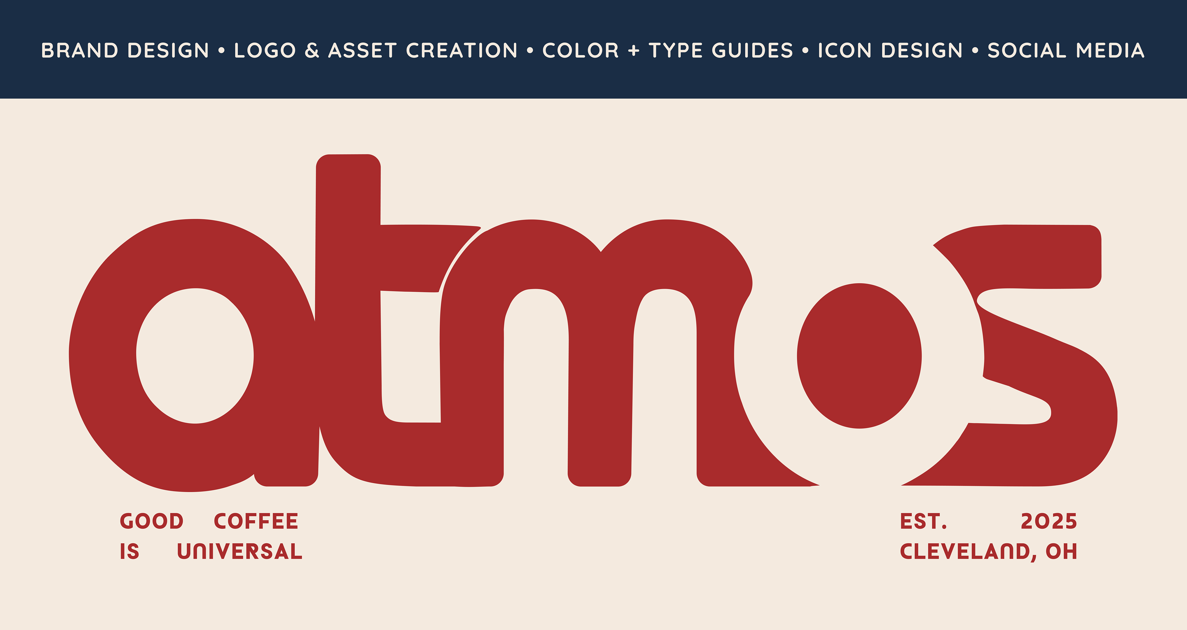
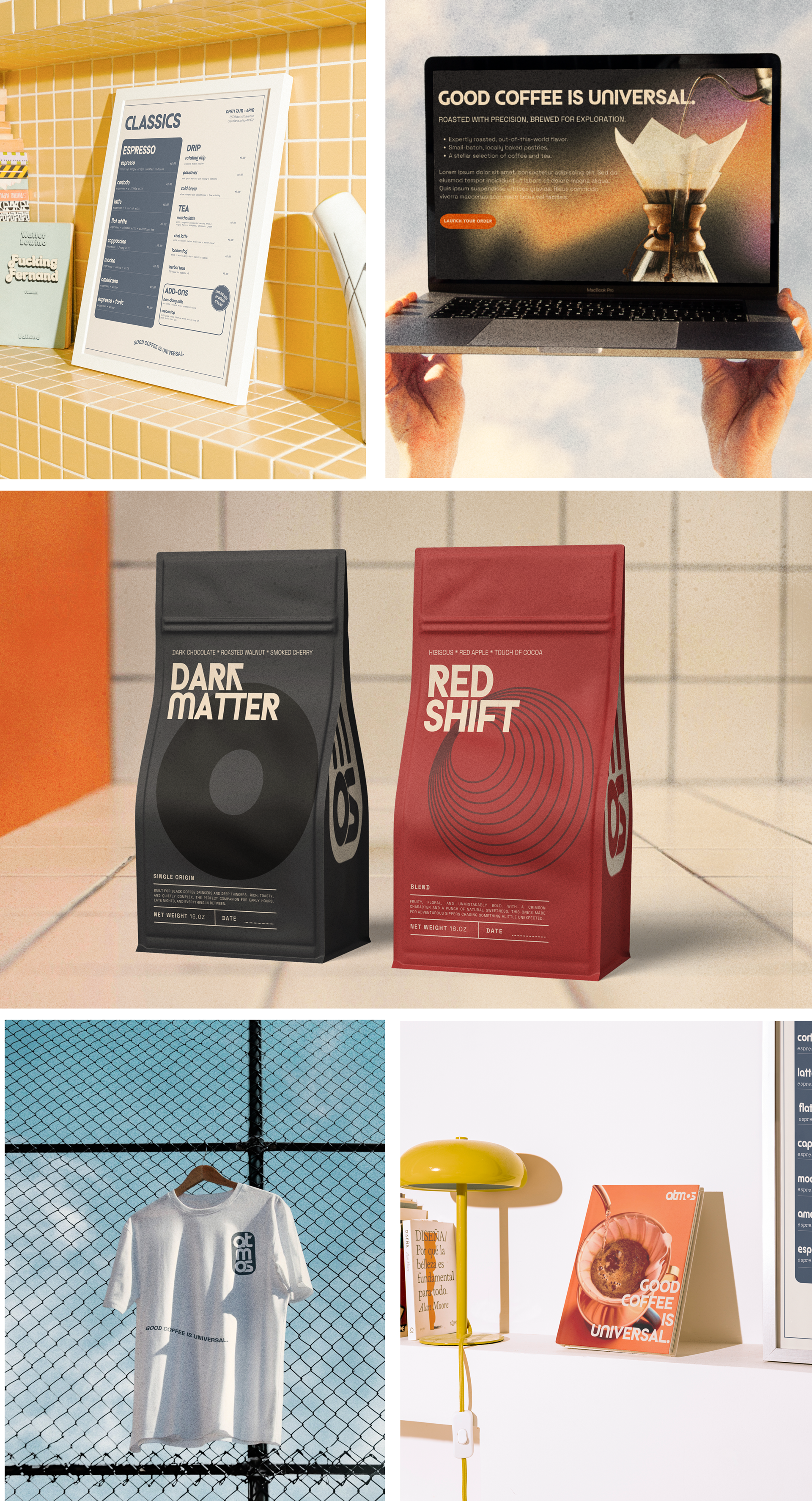
The Project: Atmos Coffee sought to stand out in Cleveland’s crowded coffee scene. They wanted something bold, minimal, and a bit unexpected, so that whether someone saw a cup, a poster, or a bag of beans, they’d recognize it right away.
Approach: I blended Bauhaus-inspired shapes with a space-age color scheme to craft a brand that feels modern, graphic, and distinctly theirs. Every piece, from the coffee sleeves to the wall posters, was designed to create a seamless visual experience.
What I did: Branding, logo and asset creation, color and typography guides, icon design, and social media content.
The Project: Atmos Coffee sought to stand out in Cleveland’s crowded coffee scene. They wanted something bold, minimal, and a bit unexpected, so that whether someone saw a cup, a poster, or a bag of beans, they’d recognize it right away.
Approach: I blended Bauhaus-inspired shapes with a space-age color scheme to craft a brand that feels modern, graphic, and distinctly theirs. Every piece, from the coffee sleeves to the wall posters, was designed to create a seamless visual experience.